how to reduce shopping cart abandonment: 5 tactics that work
Before you can start plugging the leaks in your checkout process, you have to find out where they are. Guesswork won't cut it. To really slash your cart abandonment rate, you need to step into your customer's shoes and figure out exactly what’s causing them to bail at the last minute.
The goal is to scale without dubious shortcuts and without hurting your credibility.
The real reasons often boil down to unexpected costs, a clunky checkout experience, or a simple lack of trust. Finding your store's specific friction points is the only way to start winning back that lost revenue.
Why Shoppers Really Abandon Their Carts
It's time to put on your detective hat. It’s easy to read about the global 70.19% cart abandonment rate and assume your problems are the same as everyone else's, but that's a trap. Generic fixes rarely work. The goal here is to stop guessing and start gathering real data that tells the story of what your shoppers are actually experiencing.
Think about it: why would someone get excited enough to add a product to their cart, only to vanish moments before entering their payment info? Understanding that moment of hesitation is everything.
Pinpointing Friction with Analytics and Heatmaps
Your first port of call should always be your website analytics. A tool like Google Analytics is invaluable for seeing exactly where people are dropping off. If you notice a huge exit rate on the page where you ask for shipping details, you’ve just found a massive clue. Analytics gives you the "where," but you still need to figure out the "why."
That’s where visual behavior tools are a game-changer. Heatmaps and session recordings let you see your checkout process through your customers' eyes.
- Heatmaps show you in aggregate where people are clicking, tapping, and scrolling. You can quickly spot if they're ignoring your "Continue to Payment" button or getting distracted by something else.
- Session recordings are even better. It’s like watching a video replay of a real user's visit. You can see their mouse moving frantically, hesitating over a field, or trying to click on something that isn't a link.
These tools turn abstract numbers into concrete, "Aha!" moments. Suddenly, you see that people are rage-clicking a broken promo code button or scrolling up and down because they can't find the shipping cost.
The Problem of Unexpected Costs
While you're digging through the data, don't forget the most common villain of all: surprise fees. Hands down, one of the quickest ways to see an improvement is to be completely transparent about all costs upfront.
Time and time again, studies show that unexpected costs are the top reason for abandonment. In fact, 48% of US shoppers name surprise shipping, taxes, and other fees as the main reason they ditch their purchase. It's a massive, and often easily solvable, problem.
Tackling shopping cart abandonment isn't about finding one magic bullet. It's about systematically removing every piece of friction, doubt, and surprise from the path to purchase, starting with a deep dive into your own data.
Gathering Direct Customer Feedback
If you really want to know why people are leaving, why not just ask them? This is where direct feedback becomes your secret weapon.
Exit-intent pop-ups can be incredibly effective. Just as a user’s cursor moves to leave the page, a simple survey can appear asking, "What stopped you from completing your purchase today?" The raw, unfiltered feedback you get from this is pure gold.
You can also survey customers after a successful purchase. A quick question like, "Was there anything that almost stopped you from buying today?" can uncover friction points that some people pushed through but others might not.
When you combine the hard data from analytics with the human stories from surveys, you get a complete, 360-degree view of your checkout’s weaknesses. For a deeper look into the common culprits, check out these 5 common reasons why customers abandon their carts.
To help you get started, here's a quick rundown of common triggers and the tools you can use to diagnose them.
Common Cart Abandonment Triggers and Diagnostic Tools
| Abandonment Trigger | Potential Cause | How to Diagnose |
|---|---|---|
| Unexpected Shipping Costs | High rates, slow delivery times, or costs revealed too late. | Google Analytics (checkout funnel exits), Exit-Intent Surveys, Competitor Analysis |
| Complex Checkout | Too many form fields, account creation required, confusing layout. | Session Recordings (e.g., Hotjar, FullStory), User Testing, Heatmaps |
| Technical Glitches | Broken buttons, slow page loads, payment gateway errors. | Error Monitoring Tools, User Feedback (surveys/support tickets), Session Replays |
| Lack of Trust | Missing security seals, no reviews, poor site design. | On-page Surveys, A/B Testing Trust Badges, Heatmaps (to see if seals are noticed) |
| Discount Code Issues | Shoppers leave to find a code and don't return, code doesn't work. | Session Recordings, Heatmaps (shows focus on promo box), Analytics |
Using this table as a starting point, you can create a focused plan to investigate each potential issue on your own site. This structured approach helps ensure you're solving real problems instead of just chasing symptoms.
Crafting a Frictionless Checkout Experience
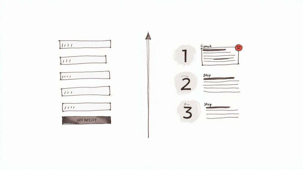
The moment a customer decides to buy, you’re in the final stretch. Don't let a clunky, confusing checkout process trip you up at the finish line. This is where so many sales, ones you thought were locked in, just vanish. The data backs this up: a staggering 22% of shoppers will ditch their cart if the checkout is too long or convoluted.
Your mission is to make paying feel like an easy, natural conclusion to their shopping trip, not a tedious chore. Every single form field, every extra click, and every slow page load adds a tiny bit of friction. One extra step might not seem like a big deal, but these little annoyances stack up fast, wearing down a customer's patience until they just give up.
Get Out of Their Way with Guest Checkout and Simpler Forms
Forcing someone to create an account before they can hand you their money is one of the most common—and most damaging—mistakes in e-commerce. It’s a huge roadblock dropped right in front of them when their motivation to buy is at its peak. Think about it: 26% of shoppers admit to leaving a site specifically because they were forced to create an account.
The fix is surprisingly simple: always offer a guest checkout. Let people buy things with the bare minimum of information. You can always invite them to create an account after the sale is confirmed, using the details they've already provided. It’s a much smoother experience.
Once they're actually checking out, be ruthless about the information you ask for. If it’s not absolutely essential to fulfill the order, cut it.
- Ditch optional fields: Do you really need their phone number? Is that second address line critical? If it's not a "must-have," get rid of it.
- Use smart defaults: Automatically check the box that makes the billing address the same as the shipping address. Pre-select your most popular shipping method. Small shortcuts like this make a big difference.
- Turn on address auto-completion: This is a game-changer, especially for mobile users. As they type, their address pops up. It cuts down on typos and makes the whole process feel faster and more modern.
Design for Clarity and Keep the Momentum Going
The look and feel of your checkout page matters more than you think. A cluttered design packed with distractions can make a customer feel anxious and overwhelmed. A clean, focused layout, on the other hand, keeps their eyes on the prize: completing the purchase.
One of the best tools for this is a simple progress bar. When someone can see they’re on "Step 2 of 3," it gives them a sense of control and forward movement. It shows them the light at the end of the tunnel and motivates them to finish.
A great checkout experience feels invisible. It's so intuitive and quick that the customer barely notices it happening, allowing them to stay focused on the excitement of their new purchase.
Finally, make your call-to-action (CTA) buttons big, bold, and obvious. Use a color that pops against the rest of the page, with clear, direct text like "Continue to Payment" or "Place Your Order." For mobile shoppers, make sure these buttons and form fields are large enough to be tapped easily without zooming in.
By focusing on these key areas, you can directly improve that final, critical stage of the buyer's journey. For a deeper dive, these ecommerce checkout optimization strategies are a great resource for spotting and fixing these common conversion killers.
Building Unbreakable Trust at Checkout
The moment a customer hits your checkout page, a flicker of hesitation is almost inevitable. For new buyers, that hesitation is even stronger. They’re asking themselves, "Is this site legit? Is my information safe here?" Any shred of doubt is enough to make them bounce.
That final step—handing over their payment details—requires a huge leap of faith. Your job is to make that leap feel like a small, confident step. It all comes down to wrapping your checkout process in a layer of trust, reassuring shoppers that buying from you is a secure, smart decision. After all, research shows that a staggering 25% of shoppers ditch their carts purely because of concerns about credit card security.
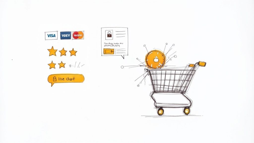
Display Trust Signals Where They Matter Most
Trust signals aren’t just for your homepage. Their impact is ten times more powerful right at the point of purchase. Think of these as visual handshakes, assuring your customer that you’re a professional and secure operation. For maximum effect, place them directly next to the fields where people enter their most sensitive info.
Here's how to strategically build that confidence:
- SSL Certificates: An SSL (Secure Sockets Layer) certificate is table stakes these days. While modern browsers show a small padlock, don't rely on that alone. Reinforce the message by displaying a recognized SSL badge from a provider like Norton or McAfee right near your payment form.
- Payment Provider Logos: Seeing familiar logos like Visa, Mastercard, PayPal, and Shop Pay is incredibly reassuring. These brands are globally trusted, and their presence on your site is a form of borrowed credibility.
- Security Seals: Badges that show you're PCI compliant or meet other security standards prove you’re serious about protecting customer data.
These small icons are powerful psychological triggers. They scream safety and professionalism without you having to write a single word, helping to soothe those last-minute checkout jitters.
Make Policies and Support Impossible to Miss
Beyond security badges, your best friend is transparency. Customers absolutely need to know they have an out if something goes wrong. A hard-to-find or confusing return policy feels like a massive red flag and can make a shopper too nervous to click "buy."
Building trust isn't a one-off tactic; it's the result of being consistently transparent and supportive. When a customer feels secure and knows you have their back, the final click to 'Buy Now' becomes an easy decision.
Plaster your key policies where they can't be missed—in the cart, at the checkout, even in the footer. A simple, clearly labeled link to your "Easy Returns" or "Shipping Policy" can answer a customer's final nagging questions before they become deal-breakers.
On top of that, easily accessible support is a huge trust booster. A visible phone number or a proactive live chat window shows there are real humans behind the screen, ready to help. If someone has a last-second question about shipping times, getting an instant answer can be the final nudge they need. It turns a cold transaction into a human interaction, which is a game-changer for reducing cart abandonment.
How to Stop Shipping Costs From Killing Your Sales
If there’s one villain in the story of abandoned carts, it has to be the surprise shipping cost. You know the feeling. A customer is excited, they’ve found what they want, and they're ready to buy. Then—BAM—an extra fee pops up right at the end and the whole experience grinds to a halt. It's no surprise this single moment is behind nearly half of all abandoned carts.
But here’s the thing: this common friction point doesn't have to be a conversion killer. With a bit of transparency and strategic thinking, you can turn what is often a huge liability into a powerful reason for customers to buy from you.
Don't Surprise Them at the Finish Line
The absolute worst time to tell someone about shipping costs is on the final checkout page. By that point, they've already mentally locked in on the product's price, and any new fee feels like a last-minute penalty. The trick is to introduce these costs early and gently.
A simple shipping calculator right on the product or cart page works wonders. It lets shoppers see their estimated total before they even start plugging in their personal information. This small act of transparency builds a massive amount of trust and manages expectations, heading off the sticker shock that sends so many people clicking away.
Turn Free Shipping Into a Smart Incentive
Everyone loves free shipping. But just giving it away on every single order can eat into your profit margins faster than you can say "logistics." A much smarter approach is to set a free shipping threshold—a minimum order value that unlocks free delivery for the customer.
This simple strategy is brilliant for two reasons:
- It naturally increases your average order value (AOV). You'll see customers add one more small item to their cart just to cross that threshold.
- It puts the customer in control. Instead of a surprise fee, shipping becomes a cost they can actively choose to get rid of.
The key is to set your threshold just a little bit above your current AOV. This encourages a small upsell without making the goal feel impossible. And make sure you shout about it! Display a dynamic banner at the top of your site with messages like, "You're only $15 away from free shipping!"
When you make your shipping policies transparent and fair, you transform a major point of friction into a reason customers trust you and choose to complete their purchase.
One Size Fits Nobody: Give Customers Options
Modern shoppers expect choices. A single, one-size-fits-all shipping option just doesn't cut it anymore. Think about it: the person who needs a gift to arrive by tomorrow is in a completely different mindset than the budget-conscious shopper who is happy to wait a few extra days.
Giving them a menu of choices is empowering. At a minimum, consider offering:
- Standard Economy: Your slowest but cheapest (or free) option.
- Expedited Shipping: A premium choice for those who need it fast.
- Local Pickup: A fantastic free alternative if you have a physical location.
This kind of flexibility is a game-changer. A 2023 survey found that high shipping costs and limited delivery options were top reasons for cart abandonment in Europe, and 45% of shoppers in China said they prefer having flexible delivery options. You can see more data on how delivery options impact conversions to understand just how crucial this is for a global audience. When you give customers control, you take away that feeling of being trapped by a single, expensive shipping fee.
Winning Back Customers with Smart Recovery Campaigns
https://www.youtube.com/embed/9jaKpLnm-WQ
An abandoned cart isn’t a lost sale—not yet, anyway. Think of it as a signal of high purchase intent. This person was right there, one click away from buying. Your job is to gently nudge them back over the finish line.
Recovery campaigns are so effective because you aren't starting from scratch. You're talking to warm leads who already know your brand and have shown direct interest in a specific product.
Email has long been the king of cart recovery, and for good reason. The numbers don't lie: abandoned cart emails see an average open rate of over 41% and a click-through rate of 9.5%. That's a massive opportunity to reclaim revenue that would have otherwise vanished. The trick is to create a sequence that feels helpful and timely, not desperate.
Crafting a High-Impact Email Sequence
I've found that a simple, three-part email series works wonders as a starting point. Each message has a distinct job to do, gradually moving from a soft reminder to a final, compelling offer.
Email 1 (The Gentle Reminder): This needs to go out fast—within 30-60 minutes. The purchase is still fresh in their mind, and often, they just got distracted. The goal here is pure helpfulness, a simple "Did you forget something?" tone.
Email 2 (The Social Proof Nudge): Send this one 24 hours later. Here, you can be a bit more persuasive. This is the perfect spot to showcase a glowing customer review or a user-generated photo of the exact product they were considering. Show them what they're missing.
Email 3 (The Final Offer): After 3-5 days, it's time for your last shot. This is where you create a little urgency or, if it makes sense for your margins, offer a small incentive. A simple 10% off or a free shipping code is often all it takes to seal the deal.
To help you visualize this, here’s a blueprint I use when setting up these flows.
Abandoned Cart Email Sequence Blueprint
This table outlines a proven three-part sequence that balances timing with a clear, escalating message to effectively recover sales.
| Timing | Content Focus | Key Objective | |
|---|---|---|---|
| Email 1 | 30-60 minutes post-abandonment | A simple, helpful reminder. Showcase the product image and a clear "Return to Cart" button. | Overcome initial distractions and bring them back while the purchase intent is still high. |
| Email 2 | 24 hours post-abandonment | Add social proof. Include a top-rated review, a customer photo, or a "fan favorite" badge. | Build confidence and address potential hesitation by showing how much others love the product. |
| Email 3 | 3-5 days post-abandonment | Create urgency or provide an incentive. "Your cart is about to expire," or offer a small discount/free shipping. | Provide a final, compelling reason to complete the purchase and close the loop. |
Using a structured approach like this turns a random follow-up into a strategic conversation that respects the customer's time while maximizing your chance of conversion.
The visual below shows how evolving your shipping strategy—a common friction point—can be a powerful tool in your arsenal, especially when used as an incentive in that final recovery email.
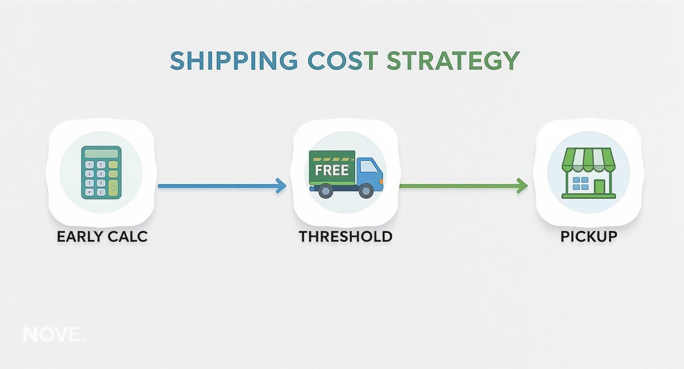
As you can see, being transparent and flexible with shipping can make a huge difference. Tying a free shipping offer into your recovery campaign directly addresses one of the biggest reasons people abandon carts in the first place.
Beyond the Inbox: Reaching Customers Everywhere
Email is your workhorse, but a truly great recovery strategy meets customers where they are. Don't put all your eggs in one basket.
SMS Reminders: If a customer has opted-in for texts, a quick message can work wonders. Keep it short, sweet, and to the point. Something like, "Hey [Name], still thinking it over? Your cart from [Store Name] is waiting for you!" with a direct link is perfect.
Retargeting Ads: Use platforms like Meta and Google to run ads that feature the exact products they abandoned. Seeing that pair of shoes they loved follow them to their social feed is a powerful visual nudge that keeps your brand top of mind.
The goal of a recovery campaign is to reopen the conversation. Whether it's through a helpful email, a timely text, or a subtle ad, you're giving an interested shopper another chance to say 'yes'.
By combining these channels, you create a smart, automated system that works around the clock. You're no longer just hoping people come back; you're actively recovering sales and turning hesitation into happy customers.
Common Questions About Cart Abandonment
Even after you've tightened up your checkout process, questions are bound to pop up. Cart abandonment is a slippery beast, and a few common uncertainties seem to trip up merchants more than others.
Let's clear the air on some of the most frequent questions I hear. Nailing these down will help you set realistic goals and build a recovery strategy that actually works.
What’s a Good Shopping Cart Abandonment Rate to Aim For?
I get this one all the time. Everyone wants a magic number, but the truth is, it's not that simple. The global average sits around 70%, but that figure swings dramatically depending on your industry and even the device your customer is using.
So, what's a realistic target? For most online stores, getting your abandonment rate under 60% is a fantastic first goal. From there, you can start chipping away at it. I've seen some incredibly well-tuned sites in niche markets get their rates down into the 40-50% range, which is pretty incredible.
The real metric for success isn't hitting some arbitrary number—it's establishing a consistent downward trend. Benchmark where you are today, and focus on incremental improvements. That's how you win this game.
How Soon Should I Send the First Abandoned Cart Email?
Timing is absolutely crucial here. You have to strike while the iron is hot. The most powerful window is within the first hour after someone leaves your site. Their desire to buy is still strong, and the specific products they were looking at are fresh in their mind.
My go-to recommendation is to send that first reminder between 30 and 60 minutes after they've bounced. It’s fast enough to feel like a helpful nudge, not a desperate plea. After that, you can set up a simple sequence: a follow-up at the 24-hour mark, and maybe a final one 3-5 days later. If they still haven't bought, that last email is a good spot to introduce a small discount as a final push.
Is Offering Guest Checkout Always the Best Option?
Yes. For almost every ecommerce store out there, the answer is an emphatic "yes." Forcing a customer to create an account before they can buy is like putting a brick wall up right at the finish line. It's a huge point of friction and a known conversion killer, stopping 26% of shoppers dead in their tracks.
Giving people a guest checkout option is one of the easiest ways to smooth out the buying process, especially for first-time visitors.
Think about it this way:
- Secure the Sale Now: Your top priority should be completing the order, not just growing your user database.
- Ask for a Sign-Up Later: You can always offer them the chance to create an account after the purchase is confirmed. All their info is already there, so it's just one click.
- Remove Any Doubt: Guest checkout makes the decision to buy that much easier.
This strategy gets the revenue in the door first and then works on building the long-term customer relationship. It’s a far smarter approach than risking the sale by creating a hurdle at the most critical moment.
Ready to cut through the noise and start optimizing like a pro? EcomEfficiency bundles over 50 premium AI, SEO, and ad-spy tools into one simple subscription. Stop juggling expensive tools and unlock everything you need to analyze your funnel, spy on competitors, and boost conversions for a fraction of the cost. Check out our plans at https://ecomefficiency.com and see why over 1,000 members trust us to power their growth.