How to Optimize Landing Pages for Better Conversions
Before we even think about tweaking button colors or split-testing headlines, we need to get the foundation right. So many marketers skip this part, but it's the bedrock of everything that follows. A truly high-performing landing page isn't just a collection of conversion tactics; it's a focused, strategic tool built on two unshakeable pillars.
The goal is to scale without dubious shortcuts and without hurting your credibility.
Get these two things right from the start, and the rest of your optimization efforts will be infinitely more successful.
Building the Foundation for a Winning Landing Page

Define One Goal. And Only One.
Every great landing page has one job. It’s not there to tell your company's life story or showcase your entire product line. Its sole purpose is to get a visitor to take one specific action. That’s it.
This "one page, one goal" rule is the most important one in the book. The second you try to make your page do two things at once, you introduce confusion and kill your conversion rate. Decision paralysis is real.
Before you write a single word of copy, decide what success looks like. Is it:
- Getting someone to fill out a lead form?
- Booking a demo for your software?
- Making a direct sale?
- Capturing an email for your newsletter?
A visitor who is forced to choose between "Download Our Ebook" and "Request a Quote" will often choose neither. You've split their focus, and a confused mind almost always says no.
Once you’ve locked in that single goal, every single element on the page—every image, every sentence, every link—must support it. If it doesn't help push the visitor toward that one action, it's just noise. Get rid of it. This ruthless focus is what creates a clear, compelling path for your users.
Get Inside Your Audience’s Head
Knowing what you want them to do is only half the battle. You have to know who you're talking to. The way you speak to a busy startup founder is going to be completely different from how you’d address a new parent looking for baby gear. Your copy, your design, and your offer have to connect with their world.
To do this, you need to understand their intent. Ask yourself:
- How did they get here? Was it a Google search, a Facebook ad, or an email?
- What did that ad or link promise them? What are they expecting to see?
- What's the immediate problem they're trying to solve?
- What are their biggest fears or hesitations about moving forward?
This context changes everything. If someone clicks an ad for a "50% off sale," that offer better be the first thing they see on the page. We call this message match, and it's crucial for building trust in those first few seconds. When the page perfectly reflects the promise that got them there, you’ve instantly shown them they're in the right place.
This groundwork ensures your page feels less like a sales pitch and more like the exact solution they were looking for. To see how these foundational principles translate into design, check out these excellent landing page design best practices.
You've got about three seconds. Seriously. That's the entire window you have to grab a visitor's attention and convince them to stick around. In that tiny sliver of time, your headline and hero section are doing all the heavy lifting.
They have one job: to instantly answer the visitor’s silent, all-important question: “What’s in it for me?”
If the answer is vague or takes too long to figure out, they're gone. A great headline doesn’t just state what you sell; it screams a clear, tangible benefit that stops the scroll cold. This isn't just a "nice-to-have"—it's the cornerstone of a high-converting landing page.

The difference between a weak headline and a great one is staggering. We've seen well-crafted headlines triple conversion rates. It’s a point reinforced by industry data, and you can dive deeper into these kinds of landing page performance statistics at LanderLab.io.
The Anatomy of a High-Impact Headline
So, what makes a headline work? It’s a cocktail of clarity, relevance, and just the right amount of emotion. It has to be specific enough to be believable but intriguing enough to make someone want to know more.
I've seen these formulas work time and time again:
- The "Benefit + Timeframe" Formula: This is all about promising a specific result in a specific period. Think of a productivity tool with the headline, "Cut Your Meeting Time in Half in Just One Week." It’s direct, benefit-focused, and manages expectations perfectly.
- The "Overcome an Objection" Formula: This one tackles a nagging fear or pain point right away. A tax software might say, "File Your Taxes with Confidence—Even If You Have No Idea What You're Doing." It builds immediate trust by acknowledging and disarming a common anxiety.
- The "Social Proof" Formula: Nothing convinces people like other people. A course platform could use, "Join 10,000+ Entrepreneurs Who Grew Their Business with Our Blueprint." This creates a powerful sense of belonging and validates your offer before they've even scrolled.
Your headline isn’t just a title. It's a thirty-word ad for the rest of your page. Its only mission is to earn you the reader's next few seconds.
Beyond the Headline: The Subheading and Hero Image
A killer headline makes a promise, but the subheading and hero image are what really sell it. These elements must work in perfect harmony to deliver a cohesive message that hammers home your value.
The subheading is your headline’s trusted sidekick. It’s your chance to add a little more context, expand on the core benefit, or knock down a secondary objection. If your headline is "The Last Project Management Tool You'll Ever Need," a great subheading might be, "Finally, an all-in-one platform that consolidates your tasks, team communication, and client reporting without the clutter."
Next, your hero image or video needs to spark an emotional connection. Forget stock photos of sterile office environments. Show the outcome. If you sell artisan coffee, don't just show a bag of beans. Show a relaxed person savoring a quiet morning with a steaming mug. Help the visitor see themselves benefiting from what you offer.
Nailing Your Value Proposition
When you combine your headline, subheading, and hero visuals, what you have is your value proposition. It’s the grand-slam reason a visitor should choose you and not the ten other tabs they have open.
To make sure your value prop is rock-solid, it has to clearly communicate three things:
- Relevancy: How, specifically, does your offer solve their problem or make their life better?
- Quantified Value: What are the concrete, measurable benefits they can expect?
- Unique Differentiation: What makes you the absolute best choice over all competitors?
Get this opening combination right, and you've created a powerful first impression that answers "What's in it for me?" so convincingly that visitors can't help but scroll down for more.
Designing an Effortless User Experience
A killer headline might get someone's attention, but a clunky, confusing design will make them leave in seconds. The user experience (UX) is that invisible force guiding visitors from the "I'm just looking" stage to taking action. When done right, the path to conversion feels natural, intuitive, and completely seamless.
Bad UX, on the other hand, creates friction. Every little moment of confusion or hesitation adds up until your visitor just gives up and clicks away. Our job is to hunt down and eliminate every last bit of that friction.
Establishing a Clear Visual Hierarchy
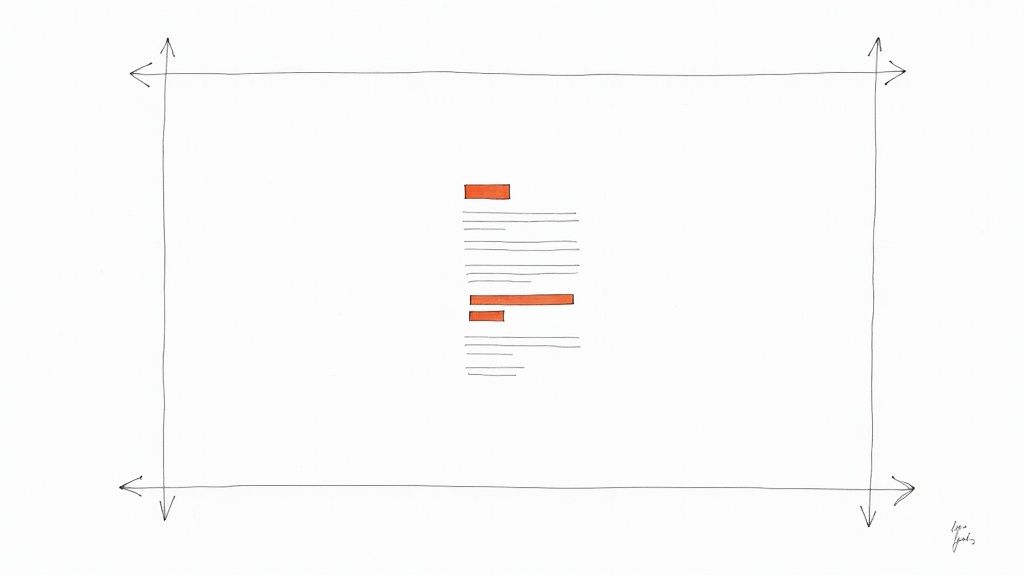
Visual hierarchy is simply about telling your visitor's eyes where to go and in what order. It’s the practice of using design cues—like size, color, and spacing—to make the most important information impossible to miss. Your headline should always be the biggest, boldest text, followed by subheadings, and then your body copy. This simple structure tells the brain what to read first, second, and third.
Think about it this way: your call-to-action (CTA) button should be the star of the show. It needs to pop. Use a bright, contrasting color that stands out from everything else on the page. And don't bury it at the bottom; place it where someone's eyes naturally land after they’ve read your key selling points.
Good visual hierarchy isn't just about aesthetics; it's a strategic way to channel attention straight toward your conversion goal.
Using Whitespace and Layout to Guide the Eye
Whitespace (or negative space) is just the empty area around your text and images. It's easily one of the most powerful—and overlooked—tools in landing page design. Giving your content room to breathe makes the page feel less cluttered and dramatically improves readability.
A clean, open layout signals professionalism and builds trust. I almost always recommend a single-column layout, as it creates a super-focused experience, especially on mobile devices. If you have dense information to convey, break it up.
- Keep paragraphs short. Aim for just two or three sentences, max.
- Use bullet points. They're perfect for quickly listing out features or benefits.
- Add relevant images or icons. Visuals provide a mental break and help reinforce your message.
This kind of structure creates a predictable rhythm, making it easy for people to scan your content without feeling overwhelmed. A well-organized page respects your visitor's time, and that's a huge part of effective landing page optimization.
Designing Forms People Actually Want to Fill Out
Let's be honest: the form is usually the biggest roadblock on a landing page. Every single field you add is another reason for someone to bounce. The golden rule here couldn't be simpler: only ask for what you absolutely need.
If it's a newsletter signup, just get their email. For a demo request, maybe you need a name, email, and company. If you really need more information, break it into a multi-step form. Showing just a couple of fields at a time feels far less intimidating.
The perceived effort of filling out a form is often more important than the actual effort. A clean, simple form with clear labels and real-time error feedback feels way less like a chore.
You also need to build trust right where it matters most—at the point of data entry. A tiny privacy note like "We'll never share your email" or a few security badges can make a huge difference in completion rates. A frictionless form is the final, critical piece of a truly effortless user experience.
Creating Calls-to-Action That Beg to Be Clicked
Every single element on your landing page—the headline, the visuals, the copy—is working to funnel a visitor's attention toward one critical moment of decision. This is where your call-to-action (CTA) takes the stage. A weak CTA is like a leaky pipe; it lets all that built-up interest and momentum drain away right when it matters most.
A truly effective CTA isn't just a button. It’s a powerful psychological trigger that has to be compelling, crystal clear, and perfectly aligned with why your visitor is there in the first place. This is your final shot to turn a curious browser into a committed lead or customer.
From Boring to Benefit-Driven Button Copy
Let's start with the actual words on the button. Generic, one-word commands like "Submit," "Download," or "Click Here" are just lazy. They're uninspiring and, frankly, a bit demanding. They tell the user what they have to do, not what they're going to get. That's a huge missed opportunity.
The best CTA copy is always benefit-oriented. It should complete the sentence, "I want to..." from your user's point of view. Think about the value exchange. Instead of "Submit," which feels like you're giving something up, try "Get My Free Ebook." See the difference? The focus immediately shifts from the user's action to their reward.
Here are a few examples of this simple but powerful transformation:
- Instead of "Sign Up": Try "Start My Free Trial" or "Join the Community."
- Instead of "Download": Use "Get My Marketing Cheatsheet" or "Unlock the Guide Now."
- Instead of "Submit": Opt for "Request a Free Quote" or "Book My Consultation."
Your button copy should be the logical conclusion to the promise you made in your headline. It’s the final, satisfying click that delivers the value you've been building up across the entire page.
Designing a CTA for Maximum Impact
Once you've nailed the copy, the design of your CTA has to make it impossible to miss. A great CTA button doesn’t blend in; it stands out with purpose. This comes down to a careful balance of color, size, and placement.
Color and Contrast
Your CTA button needs a color that creates a stark contrast with the page's background and the elements around it. If your page has a cool blue and white theme, a vibrant orange or bright green button will pop. You're trying to create a visual "target" that naturally draws the eye.
Size and Shape
The button needs to be big enough to be easily tapped on a phone, but not so big it becomes obnoxious. I've found that rounded corners often feel friendlier and more "clickable" than sharp, rectangular edges. Also, don't be afraid to add a subtle hover effect, like a slight change in color or size. It gives instant visual feedback that the button is interactive.
Placement
Put your CTA where a user’s eyes will naturally land after they've read your value proposition. For most pages, this means placing it "above the fold" so it's visible without any scrolling. If you have a longer landing page, it's a smart move to repeat the CTA—once near the top, maybe again in the middle, and definitely one more time at the very bottom.
Optimizing the Area Around Your CTA
The space immediately surrounding your CTA is prime real estate. You can use it to overcome any last-minute hesitation and give users that final nudge they need. Adding social proof or trust signals right next to the button can be incredibly effective.
Think about adding a small line of text right under your CTA. Something like:
- Social Proof: "Join 15,000+ other marketers who get our newsletter."
- Urgency: "Spots are limited! Offer ends Friday."
- Risk Reversal: "100% money-back guarantee. No questions asked."
These little micro-details provide that final bit of reassurance a visitor might need before they click. Engineering the perfect CTA involves a lot more than just a button; it's about crafting a persuasive, frictionless closing argument for your offer. To dig deeper into refining your buttons and links, explore these great insights on what makes a good call-to-action.
Using Data and A/B Testing to Drive Decisions
https://www.youtube.com/embed/eiIhTbFP0ls
Relying on gut feelings to change your landing page is a bit like sailing without a compass. Sure, you might get lucky and find your destination, but you’re far more likely to end up lost at sea. The real secret to consistent, predictable improvement comes from data.
When you start analyzing user behavior and systematically testing your assumptions, you can finally stop guessing. This is how you start making informed decisions that actually move the needle. This approach turns landing page optimization from a one-off task into a continuous cycle of improvement, where you're always learning what truly connects with your audience.
Translating Analytics into Actionable Insights
Your journey into data-backed optimization kicks off in your analytics platform, whether that's Google Analytics or another tool like HubSpot. Instead of drowning in dozens of metrics, you just need to focus on a few key performance indicators (KPIs) that tell a clear story about what’s working and what isn't.
Here are the essential metrics I always keep an eye on:
- Bounce Rate: What percentage of people land on your page and leave without clicking anything? A high bounce rate often points to a disconnect between your ad and your landing page. Maybe the promise you made wasn't kept.
- Time on Page: How long are visitors actually sticking around? If the average time is just a few seconds, it’s a big red flag that your headline and hero section aren't grabbing their attention.
- Goal Completions: This is your North Star. Are people actually filling out the form or clicking the "Buy Now" button? This metric tells you, in no uncertain terms, if your page is doing its one job.
- Conversion Rate: Simply put, this is the percentage of visitors who complete that goal. It's the ultimate scorecard for your page's performance.
Now, context is everything with these numbers. We see an average landing page conversion rate of around 6.6% across the board, but that figure swings wildly by industry. For example, SaaS landing pages might average 3.8%, while pages promoting events can soar to 12.3%.
The source of your traffic also makes a massive difference. This table breaks down how conversion rates can vary based on where your visitors are coming from, showing just how important it is to attract the right kind of traffic.
Average Landing Page Conversion Rates by Traffic Source
| Traffic Source | Average Conversion Rate |
|---|---|
| Email Marketing | 19.3% |
| Referral | 14.5% |
| Direct | 11.2% |
| Social Media | 9.8% |
| Organic Search | 8.1% |
| Paid Search (PPC) | 6.4% |
As you can see, traffic from email campaigns, where you're reaching a warm audience, converts at a much higher rate than paid search. It's a great reminder that quality beats quantity every time. You can explore more of these landing page statistics to see how your own numbers stack up against industry benchmarks.
Building and Executing Meaningful A/B Tests
Once your analytics have helped you spot a problem area—let's say you have a shockingly high bounce rate—it’s time to form a hypothesis. A good hypothesis isn't just a random guess; it’s a specific, testable statement about a change you want to make, what you expect to happen, and why.
Weak Hypothesis: "Changing the button color will get more clicks."
Strong Hypothesis: "Changing the CTA button from blue to bright orange will increase clicks by 15% because the higher contrast will make it stand out more against the background, creating a clearer visual cue for users."
See the difference? The second one is precise and gives you a clear pass/fail metric.
With a solid hypothesis, you can run an A/B test (or split test). You create a variation of your page (Version B) that includes your proposed change and show it to a segment of your audience. The rest of your visitors see the original (Version A). The whole point is to see which version gets more people to convert.
This infographic breaks down a common testing workflow, zeroing in on the call-to-action—a perfect element to test since small changes to its copy, design, or placement can have a huge impact.
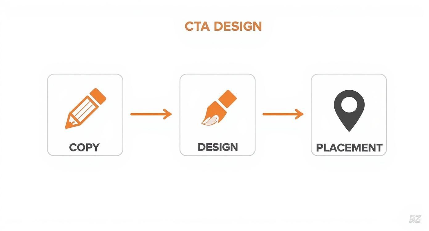
This process really highlights how methodical you need to be. It's about moving from the message itself to its visual execution and finally its strategic placement on the page.
One critical rule: only change one variable at a time. If you change the headline, button color, and the main image all at once, you’ll never know which change actually made the difference. Let the test run long enough to be statistically significant—don't call it after just a few dozen visitors.
Once you have a clear winner, roll out the change to 100% of your traffic and get ready to start the cycle all over again. Find your next opportunity, form a new hypothesis, and test it. That’s how you build a high-converting landing page for the long haul.
Your Top Landing Page Questions, Answered
Even when you have a solid playbook, tricky questions always come up. It's totally normal to get stuck on the details that can make or break a campaign. Let's dig into a few of the most common hurdles I see marketers face and get you some clear, practical answers.
Think of this as your go-to FAQ for those nagging "what if" moments. Nailing these smaller decisions is often what pushes a good landing page into "great" territory.
How Long Should My Landing Page Be?
This is the classic "it depends" question, but I can give you a better framework than that. The perfect length is dictated by two things: how complex your offer is and how much your audience already knows about you. Your goal is to be as long as you need to be, but not a word longer.
For something simple and low-risk, like signing up for a free newsletter, short and sweet wins. The visitor probably gets the value already, so you just need a sharp headline, one or two quick benefits, and the form. Get straight to the point.
But if you're selling a high-ticket service or a sophisticated piece of software, you’ve got more work to do. You need space to build trust, walk through features, show off glowing testimonials, and proactively squash any doubts.
As a rule of thumb, the higher the cost or commitment you're asking for, the more convincing you have to do. A longer page isn't just about dumping more text; it's about building a stronger, more detailed case for why they should say "yes."
Don't just guess, though. Test it. Pit a concise version against a more detailed one. Your analytics will quickly tell you what your audience actually needs to feel confident enough to click that button.
Are Pop-Ups Ever a Good Idea on Landing Pages?
Pop-ups are tricky—they can be incredibly effective or incredibly annoying, with very little room in between. The secret to using them well comes down to two things: timing and value.
Your safest and most effective option is usually an exit-intent pop-up. This only triggers when a user’s cursor moves up toward the address bar or the "close tab" button. It’s a last-chance offer that doesn’t interrupt their initial experience.
What you almost never want to do is hit someone with a pop-up the second they arrive. It’s like a salesperson jumping in front of you the moment you walk into a store. It’s jarring, and it’s a great way to send your bounce rate through the roof.
If you do use a pop-up, make the offer irresistible.
- A quick discount: A simple 10% off can be just the nudge someone needs.
- A valuable resource: Offer a free checklist, e-book, or guide that’s directly related to the page's topic.
- A final reminder: Reiterate the core benefit one last time before they go.
And always, always make sure it’s dead simple to close. Finally, watch your conversion rates closely to prove the pop-up is actually helping, not hurting.
How Should I Optimize for Mobile Users?
Let's be clear: mobile optimization isn't a "nice-to-have" anymore. It's everything. With most of your traffic likely coming from phones, a clunky mobile experience is a direct line to lost conversions. And it’s about so much more than just a responsive layout.
The name of the game on mobile is making the experience fast, easy, and frictionless.
- Simplify Ruthlessly: Mobile users are on the go and have zero patience for fluff. Slash your copy, use simpler images, and make sure your main message and CTA are visible above the fold.
- Design for Thumbs: Buttons and form fields need to be big enough to be tapped easily with a thumb. Leave plenty of whitespace around clickable elements to prevent frustrating mis-taps.
- Obsess Over Speed: Mobile networks aren't always reliable. Compress every image and get rid of any heavy scripts or code that could slow things down. A one-second delay can have a huge impact.
Start thinking "mobile-first," not just "mobile-friendly." When you design for the smallest screen from the very beginning, it forces you to prioritize what's truly essential.
Ready to stop paying for dozens of separate marketing tools? With EcomEfficiency, you get consolidated access to over 50+ premium AI, SEO, and ad-spy tools in one simple subscription. Cut your software costs by up to 99% and streamline your entire e-commerce workflow. Check out our plans and start saving today at EcomEfficiency.