How to Improve Ecommerce Conversion Rates: A Practical Guide
If you want to boost your e-commerce conversion rate, you can't just throw things at the wall and see what sticks. The process is much more methodical. It starts with digging into your data to establish a clear baseline, then moves on to systematically improving your product pages, checkout flow, and overall user experience.
The goal is to scale without dubious shortcuts and without hurting your credibility.
This is all about understanding the percentage of website visitors who complete a purchase and then taking deliberate steps to increase that number.
Finding Your True Conversion Performance
Before you can fix a leaky bucket, you have to find the holes. Improving your conversion rate works the same way. It begins with a deep, honest look at how your store is actually performing right now.
Simply knowing your overall conversion rate isn't enough; the real, actionable insights are always buried in the details. The goal here is to get past the guesswork and focus your energy where it’s going to make a real difference.
This initial dive into your analytics is what transforms a vague problem like "low sales" into a specific, solvable challenge like, "mobile users from Instagram ads are abandoning their carts at the shipping stage." One is a mystery; the other is a puzzle you can solve.
Segment Your Data to Uncover the Real Story
Your overall conversion rate is just an average, and averages can be dangerously misleading. One really high-performing channel could be hiding a few that are failing miserably. The first thing I always do is start segmenting the analytics data to compare how different groups of visitors behave.
It's all about asking the right questions:
- By Traffic Source: Is your organic traffic from Google converting better than visitors from your paid social media campaigns? A big gap here often points to a mismatch between your ad creative and what people see when they land on your site.
- By Device Type: Are mobile users bouncing at a much higher rate than desktop users? This is a classic problem. It’s usually a dead giveaway that your mobile site is clunky or the checkout process wasn't designed for a small screen.
- By Customer Demographics: How do new visitors convert compared to your loyal returning customers? If there's a big drop-off for new people, you might have a trust issue or need to offer a stronger first-purchase incentive.
Key Conversion Rate Benchmarks to Measure Against
Knowing where you stand compared to others is crucial. This table provides a quick reference for average conversion rates, helping you see if you're on track or lagging behind.
| Metric | Benchmark Average | High-Performer Target |
|---|---|---|
| Global E-commerce (All Devices) | 2% - 4% | 5%+ |
| Desktop Users | 4.8% | 6%+ |
| Mobile Users | 2.9% | 4%+ |
| Food & Beverage Industry | 6.82% | 8%+ |
| Luxury Goods Industry | 0.98% | 2%+ |
These numbers tell a compelling story. For instance, even though 73% of traffic comes from mobile, desktops still convert at a much higher rate (4.8% vs. 2.9%). This highlights a massive opportunity for anyone who can crack the code on mobile optimization. You can discover more insights about e-commerce conversion rates on networksolutions.com to see how you stack up.
Your data tells a story about what your customers want and where they struggle. Your job is to listen carefully to that story and then rewrite the ending.
Establish a Baseline with a Conversion Audit
Once you’ve identified your key segments, it's time for a quick conversion audit. This doesn't need to be a month-long project. Think of it as a focused review of your most important user journeys to spot the obvious points of friction.
Put yourself in your customers' shoes. Open a new browser window and walk through the buying process as if you're a first-time visitor—do it once on desktop and again on your phone.
Start on a key product page, add an item to the cart, and go all the way through checkout. As you do, document everything and ask yourself these questions:
- Is the "Add to Cart" button immediately visible without scrolling?
- Are shipping costs shown clearly and early in the process?
- How many form fields do I really have to fill out to buy this?
- Is there an easy guest checkout option?
This simple, hands-on audit will almost always reveal some low-hanging fruit—those small but incredibly frustrating things you can fix right away for an immediate lift. This gives you a qualitative baseline to go with your quantitative data, painting a complete picture of where your conversion engine needs a tune-up.
Turn Your Product Pages into Persuasion Engines
Once a visitor lands on your website, your product page is where the magic needs to happen. This is the moment of truth. We're not just creating a digital catalog entry here; we're building your most important sales pitch. If you want to see a real lift in your e-commerce conversion rates, turning this page into a persuasion powerhouse is one of the most direct routes you can take.
The real goal is to get ahead of every question, doubt, or hesitation a potential buyer might have. You need to build so much confidence and excitement that clicking "Add to Cart" feels like the only logical next step. It all comes down to a smart mix of great visuals, copy that connects, and powerful social proof.
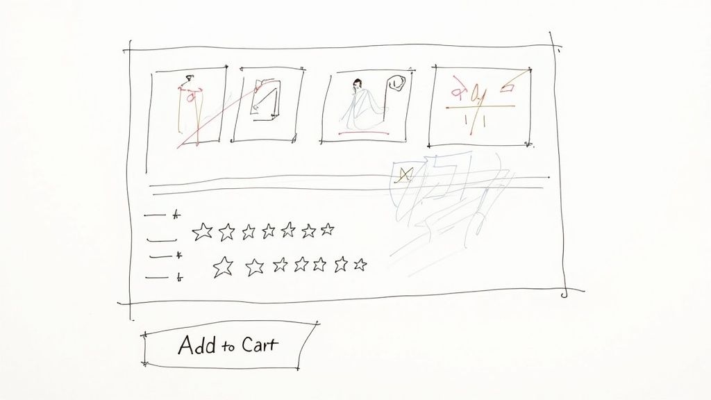
Captivate with Compelling Visuals
Online, your customers can't pick up the product, feel its weight, or examine the texture. Your images and videos have to do all that heavy lifting for them. I've seen countless sites where grainy, single-angle photos kill an otherwise great product by creating doubt. Your visuals must bridge that gap between the digital and the physical.
Don't just upload one sterile product shot and call it a day. A truly effective visual game plan includes a whole suite of assets:
- High-Resolution Photos: Get professional shots from every conceivable angle. Let people zoom way in to see the fine details—the stitching on a wallet, the texture of a fabric, or the finish on a piece of hardware.
- Contextual Shots: Show your product being used in the real world. If you sell a backpack, show it on someone hiking a trail, not just floating on a white background. This helps customers mentally place the product in their own lives.
- 360-Degree Views: These are fantastic. Giving shoppers the control to spin a product around provides a much better sense of its dimensions and features than static photos ever could.
- Product Videos: A quick video demo can be a conversion goldmine. Show how to assemble it, highlight its best features in action, or just showcase its quality. We know from countless studies that adding video can give conversion rates a serious boost.
When you offer a rich visual experience, you're not just showing what you sell; you're proving its quality and value before they even read a single word.
Write Product Descriptions That Sell Benefits, Not Just Features
This is a classic mistake I see all the time: product descriptions that are just a dry list of tech specs. Specs have their place, but they don't sell. Benefits do. Your copy needs to solve a problem and tell a story.
The trick is to translate every feature into a clear benefit for the customer.
| Feature (What it is) | Benefit (What it does for them) |
|---|---|
| "Made with ripstop nylon" | "Built to withstand rugged trails and unexpected downpours, so your gear stays safe and dry on any adventure." |
| "Contains 1% retinol" | "Works to visibly reduce fine lines and wrinkles, giving you smoother, more youthful-looking skin." |
| "Noise-canceling technology" | "Block out distractions on your commute or in a busy office, so you can finally focus on your music or podcast." |
Break up your text. Use short paragraphs, bullet points, and bold text to make your descriptions easy to scan. A shopper should be able to glance at the page and understand the core benefits in seconds.
Harness the Power of Social Proof
Here’s a simple truth: people trust other people way more than they trust brands. That’s why social proof is so critical. When we see that others have bought and enjoyed something, we feel more confident in our own decision to do the same.
In fact, a study from Northwestern University found that just displaying customer reviews can increase conversion rates by as much as 270%. And don't worry about a few 4-star reviews; a perfect 5-star rating can sometimes feel less authentic than a more realistic mix.
Put your customer reviews and star ratings right up top, ideally just below the product title. Don't make people hunt for them. Seeing that hundreds of others have already taken the plunge instantly lowers the perceived risk.
Get creative and use different kinds of social proof:
- Star Ratings: An instant visual cue that communicates quality at a glance.
- Written Testimonials: Pull out specific, punchy quotes from happy customers. "This moisturizer cleared up my skin in two weeks!" is infinitely more powerful than "Great product."
- User-Generated Content (UGC): This is huge. Encourage your customers to share photos of themselves using your products, and then feature those images right on the product page. It’s authentic, relatable proof from real people.
Craft an Irresistible Call to Action
The final piece of the product page puzzle is your call-to-action (CTA) button. You'd be surprised how much impact small changes to its color, text, and placement can have. Your CTA needs to be unmissable.
Use a bold, contrasting color that makes the button pop right off the page. Try more action-oriented text like "Add to Bag" or "Get Mine Now" instead of a generic "Buy." And most importantly, make sure that button is "above the fold"—no one should have to scroll down to figure out how to buy from you. Every little bit of friction you remove here gets you that much closer to a sale.
Fixing the Leaks in Your Checkout Process
The checkout is the final hurdle. It’s the make-or-break moment where a curious browser becomes a paying customer, but it’s also where an astonishing number of sales simply vanish into thin air.
Think of it this way: if your website were a brick-and-mortar store, this would be like watching shoppers fill their carts to the brim, walk right up to the register, and then just abandon everything and walk out. It happens online every single second.
Cart abandonment is a monster of a problem for e-commerce. Global rates consistently hover above 70%, and that number gets even worse on mobile. The single biggest culprit? Sticker shock. Those unexpected shipping costs, taxes, and fees that pop up at the last second are poison to a smooth sale. In fact, these surprises have been blamed for nearly half of all abandoned carts. The lesson is crystal clear: transparency isn't just nice, it's necessary. You can explore more statistics on cart abandonment from Statista.com.
To boost your conversion rates, you have to treat your checkout like a high-performance machine, tuning it to be as fast, simple, and trustworthy as possible.
Eliminate Surprise Costs and Build Trust
The number one rule of checkout optimization is no surprises. Nothing kills a conversion faster than a final total that doesn't match the customer's expectation. It instantly shatters trust and makes people feel like they've been tricked.
The only way to combat this is with radical transparency right from the start.
- Add a Shipping Calculator: Put a shipping calculator right on the cart page. Let customers see the estimated costs before they even commit to checking out.
- Promote Your Shipping Thresholds: If you offer free shipping over a certain order value (like "$50 for free shipping"), shout it from the rooftops. Put it in your site header, on product pages, and in the cart itself.
- Consider All-Inclusive Pricing: For some business models, it can be much simpler to just bake taxes and fees into the product price. The price they see is the price they pay. Simple.
Being upfront about every cost doesn't just cut down on abandoned carts; it builds a foundation of trust that keeps customers coming back.
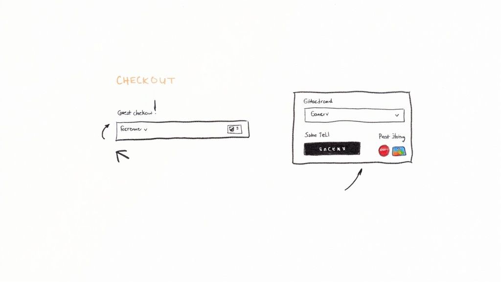
Streamline the Path to Purchase
Every single form field a customer has to fill out and every page they have to click through is another chance for them to leave. Your goal is to make the journey from cart to confirmation as short and painless as you possibly can. A clunky, complicated checkout is a guaranteed conversion killer.
Think of your checkout form as a conversation. You wouldn't ask a new acquaintance for their life story. Similarly, only ask your customers for the information that is absolutely essential to complete the transaction.
Here are a few high-impact ways to smooth out the process:
- Always Offer Guest Checkout: Forcing users to create an account is one of the oldest and most notorious reasons for cart abandonment. Let people check out as a guest. You can always invite them to create an account on the confirmation page, after you've secured the sale.
- Minimize Form Fields: Do you really need their phone number? Is the "Address Line 2" field truly necessary for most orders? Scrutinize every single field and get rid of anything that isn't essential. Use tools like address auto-complete to save them from typing.
- Use a Progress Bar: If your checkout has multiple steps, a simple visual indicator (e.g., Shipping > Payment > Review) shows customers where they are and how close they are to the finish line. It manages expectations and makes the process feel faster.
Provide Flexible Payment and Reassuring Signals
When a customer is ready to hand over their money, you need to make it incredibly easy for them to do so. Offering limited payment options is like a physical store only accepting one specific type of credit card—you’re just turning away willing buyers for no good reason.
Make sure you're catering to modern shopping habits by integrating a wide range of payment methods.
- Digital Wallets: Options like Apple Pay, Google Pay, and PayPal are non-negotiable, especially for mobile shoppers who love the convenience of one-click payments.
- Buy Now, Pay Later (BNPL): For higher-priced items, services from companies like Klarna or Afterpay can dramatically increase conversions by splitting the cost into more manageable payments.
- Traditional Cards: And of course, make sure you clearly show that you accept all major credit and debit cards.
Finally, sprinkle in some trust signals right where it counts. Displaying security badges (SSL certificates, McAfee, etc.) and the logos of your payment providers reinforces that the transaction is safe. Even a simple line like "Easy 30-Day Returns" placed right next to the final "Place Order" button can give a hesitant shopper the final nudge of confidence they need to click.
Using Personalization to Elevate User Experience
A generic, one-size-fits-all website is a surefire way to kill your conversion rate. Shoppers today have high expectations; they want an experience that feels like it was built just for them. If you're not delivering that, you're leaving a lot of money on the table.
This is where great user experience (UX) and smart personalization come in. The goal is to move away from a static storefront and create a dynamic, responsive journey that adapts to every single visitor. It’s about showing them products they’re actually likely to buy and making the entire process feel effortless. When you create an intuitive and relevant path, you naturally guide more people from just browsing to confidently buying.
This infographic breaks down how a personalization engine works, from gathering user data to delivering a tailored experience.
As you can see, a user's actions directly shape the content and offers they're shown. This creates a powerful feedback loop that constantly improves relevance and, in turn, boosts conversions.
Implement Dynamic Product Recommendations
One of the most powerful ways to personalize is to show visitors products they'll genuinely want. Instead of just pushing your bestsellers at everyone, you can use their behavior to make intelligent suggestions.
There are a few key places on your site where these recommendations have a huge impact:
- On the Homepage: For returning visitors, greet them with a "Picked for You" section based on what they've looked at before.
- On Product Pages: This is the perfect spot for "Frequently Bought Together" bundles or "Customers Also Viewed" carousels. It’s a natural way to introduce them to more of your catalog.
- In the Shopping Cart: Right before they check out, suggest small, relevant add-on items. It’s an easy way to nudge up your average order value.
This isn't just a nice-to-have feature. I’ve seen firsthand how tailored recommendations can drive real revenue by making the shopping experience feel more helpful and less transactional.
The Unforgiving Impact of Site Speed
Personalization is a game-changer, but it means nothing if your site is painfully slow. In e-commerce, every single millisecond matters. A slow page doesn’t just frustrate people; it actively pushes them to your competitors and eats into your profits.
A one-second delay in page load time can result in a 7% reduction in conversions. For a store earning $10,000 per day, that one second costs over $250,000 in lost sales annually.
Why is the drop-off so steep? Because slow performance shatters confidence. A lagging site feels broken or untrustworthy, and it completely disrupts a customer's buying momentum.
The good news is you can fix this. Here are the biggest culprits I see:
- Compress Your Images: Giant, unoptimized images are the number one cause of slow load times. Use tools to shrink their file size without ruining the quality.
- Choose a Fast Hosting Provider: Your hosting is the foundation of your site's speed. Skimping here is a classic mistake that will cost you in the long run.
- Minimize Apps and Plugins: Every third-party script you add can slow things down. Do a regular audit and get rid of any apps you aren’t truly using.
Perfect Your Navigation and Site Search
If shoppers can’t find what they’re looking for, they leave. It’s that simple. An intuitive navigation menu and a powerful site search are absolutely non-negotiable.
Your main menu should be clean, logical, and organized around how your customers think, not how your company is structured. Use clear, simple category names and stay away from internal jargon.
Your site search is just as critical. A great search bar acts like a helpful digital sales associate, guiding users straight to what they need. Make sure yours can handle typos and synonyms and offers predictive suggestions as they type. When someone can find their product in seconds, the path to purchase becomes almost frictionless.
Ultimately, personalization is a proven lever for growth. Industry platforms often report that tactics like tailored product recommendations can increase conversion rates by 10–15%. For Shopify stores specifically, if you can get your conversion rate above 3.2%, you're in the top 20% of performers. Getting there requires a holistic focus on the entire user journey, from page speed to checkout. You can read more research on Smart Insights to see how you stack up against industry benchmarks.
Building Your Continuous Optimization Strategy
Boosting your conversion rate isn't a project you complete and then check off a list. The e-commerce brands that truly dominate their space know it's a constant cycle of learning, testing, and refining. You’re building a culture of optimization, and it’s this commitment that turns a good store into a great one and keeps you one step ahead.
This mindset shifts your entire approach. Instead of making changes based on a hunch or what a competitor is doing, you start making decisions backed by hard data from your own users. You stop guessing what customers want and create a system that lets them show you. The engine of this system is structured testing.
It all kicks off with a clear idea you want to validate, which we call a hypothesis. A solid hypothesis isn't just a random thought; it’s a specific, measurable statement about a change you believe will produce a positive result.
Mastering the Art of A/B Testing
A/B testing, or split testing, is the bread and butter of conversion rate optimization. It’s a beautifully simple concept: you compare two versions of a webpage—the original "control" (Version A) against a new "variation" (Version B)—to see which one performs better.
Here’s how it works in practice: you split your website traffic, sending half to Version A and the other half to Version B. After enough people have visited both versions, you analyze the data to see which one led to more conversions. Once you have a statistically significant winner, you roll out the better-performing version to 100% of your audience.
A good hypothesis isn't complicated. It just needs a clear structure: "If I change [X], then [Y] will happen, because [Z]."
- Real-World Example: Let's say we run an online store for high-end coffee beans. Our hypothesis could be: "If we change the 'Add to Cart' button from our standard blue to a vibrant, coffee-toned orange, we expect the add-to-cart rate will increase because the button will stand out more against our site's earthy color palette."
This gives you a perfect framework for an experiment. You know exactly what you’re changing, the specific metric you're tracking, and why you think it will work.
A/B testing is the ultimate tie-breaker. It takes ego and guesswork out of the equation and lets the data do the talking. Every change you implement becomes a proven step forward.
How to Prioritize Your Tests for Maximum Impact
You could test literally hundreds of things on your site, but your resources—namely your time and traffic—are limited. This is where smart prioritization comes in. You need to focus your energy where it counts the most.
Start with your highest-traffic pages where even a small lift in conversions can mean a huge revenue boost. We're talking about your homepage, key category pages, top-selling product pages, and, of course, the checkout flow.
Here are a few high-impact elements I always recommend starting with:
- Headlines & Value Props: Test different ways to communicate what makes you special. Is it "Free Shipping Over $50" or "Artisan Coffee, Delivered Fresh"?
- Call-to-Action (CTA) Buttons: Go beyond color. Experiment with the text ("Buy Now" vs. "Add to Bag"), size, and even its placement on the page.
- Product Imagery: How do clean studio shots compare to lifestyle photos of your product in use? What happens when you add a short product video to the mix?
- Page Layout: Try moving your customer reviews or trust seals (like secure payment logos) higher up on the page, right where people are making a decision.
To help you get started, here are some ideas for your first A/B tests, ranked by their potential to move the needle.
A/B Testing Ideas for Maximum Impact
| Element to Test | Example Variation | Potential Impact Level |
|---|---|---|
| Call-to-Action (CTA) Button | Change button text from "Submit" to "Get My Free Quote" | High |
| Headline & Sub-headline | Test a benefit-driven headline vs. a feature-focused one | High |
| Page Layout & Flow | Place customer testimonials directly below the CTA | High |
| Product Images | Use a 360-degree product view instead of static images | Medium-High |
| Offer/Value Proposition | A/B test a 10% discount vs. free shipping | Medium |
| Form Fields | Remove a non-essential field like "Phone Number" | Medium |
| Button & Link Colors | Change the primary button color to a high-contrast shade | Low-Medium |
| Font Size & Readability | Increase body text font size from 14px to 16px | Low |
Focus on the high-impact tests first. These are the changes most likely to give you significant, measurable wins that you can build on for future experiments.
Expanding Beyond Simple A/B Tests
While A/B testing is your workhorse, it’s not the only tool in the toolbox. For more complex questions, you might need a different approach.
Multivariate Testing is like A/B testing on steroids. It lets you test multiple changes on a single page at the same time. For example, you could test two different headlines, three hero images, and two CTA buttons all in one experiment. It’s fantastic for seeing how different elements interact with each other, but be warned: it requires a lot more traffic than a simple A/B test to get clean, reliable data.
User Testing is where you get the "why" behind the numbers. A/B testing can tell you that Version B won, but it can’t tell you why users preferred it. With tools from platforms like UserTesting or Maze, you can literally watch people interact with your site and hear their thoughts out loud. This qualitative feedback is gold, and it will fuel your next round of hypotheses.
When you combine quantitative data from A/B tests with qualitative insights from user testing, you create a powerful feedback loop. It ensures that your efforts to improve e-commerce conversion rates are always guided by real customer behavior, not just a shot in the dark.
Common Questions About Ecommerce Conversion
Even with the best-laid plans, you're going to have questions. Getting your conversion rate where you want it is a marathon, not a sprint, and it's easy to wonder if you're even running in the right direction.
Let's clear up a few of the most common questions we hear from store owners. This is your go-to spot for troubleshooting those nagging issues and making sure you're focusing on what actually drives sales.
What Is a Good Ecommerce Conversion Rate?
Everyone asks this, and the only honest answer is: it depends. What's considered "good" is all over the map depending on your industry, the price of your products, and where your traffic is coming from. While you'll see a global average of around 2% to 4% thrown around, you shouldn't treat that as gospel.
Think about it—a store selling $2,000 custom sofas would be ecstatic with a 1% conversion rate. Meanwhile, a shop selling popular, low-cost phone cases might be shooting for 5% or higher to hit their revenue goals.
Instead of chasing a universal number, benchmark against what matters:
- Your own history: Are you doing better this month than last month? That's progress.
- Your direct competition: How do you stack up against others selling similar products to a similar audience?
Focus on consistent, steady improvement. That's the real win.
Why Do Product Pages Have Such a Big Impact?
Your product page is the final sales pitch. It's where a casual browser decides to become a paying customer. They've clicked through your ads or categories, and now they're here, asking themselves, "Is this really worth it?"
This is the make-or-break moment. A great product page anticipates and answers every question, overcomes every objection, and connects with the customer's needs.
An effective product page builds so much confidence and provides so much clarity that clicking "Add to Cart" feels like the most natural and logical next step. It removes doubt and replaces it with excitement.
Powerful images, compelling copy that sells the benefits (not just the features), and genuine social proof like reviews—they all work together to build the trust needed to make a sale.
What Are Some Easy Wins to Boost Conversions?
Looking for some quick, high-impact changes? Your best bet is to focus on reducing friction and building trust right away. You don't always need a massive overhaul to see results.
Here are a few of the fastest wins you can implement this week:
- Add Trust Signals: Make sure your security badges, money-back guarantees, and accepted payment logos (Visa, PayPal, etc.) are clearly visible, especially during checkout. These small icons offer huge peace of mind.
- Simplify Your Forms: Take a hard look at every field in your checkout process. Do you really need their phone number right now? Each field you remove is one less reason for someone to give up.
- Offer Guest Checkout: Forcing a new customer to create an account is one of the biggest conversion killers out there. Make the guest checkout option the most obvious and easy choice.
Why Does Site Speed Matter So Much?
In ecommerce, speed isn't just a feature—it's a foundation of trust. A slow site feels clunky and unprofessional, making potential buyers wonder if your entire operation is just as unreliable. Every second of delay chips away at a customer's confidence.
The data doesn't lie. Research from Google shows that when a page’s load time goes from one to three seconds, the chance of a visitor bouncing skyrockets by 32%. If it takes five seconds? That probability jumps to 90%.
Simply put, if your site is slow, a huge chunk of your potential customers will leave before they even see what you have to offer.
Ready to stop guessing and start growing? EcomEfficiency bundles 50+ premium tools for product research, competitor analysis, and marketing optimization into one simple subscription. Cut your software costs by up to 99% and get the insights you need to boost your conversion rates.