A Guide to the Helium 10 Dashboard
Think of the Helium 10 dashboard as your mission control. It's the first thing you should check in the morning and the last thing at night, giving you a complete, real-time snapshot of your Amazon business's health. All your crucial sales, profit, and advertising data are pulled into one place, so you can stop guessing and start making informed decisions.
The goal is to scale without dubious shortcuts and without hurting your credibility.
Your Amazon Business Command Center
I like to compare the dashboard to the cockpit of an airplane. It’s where you see your altitude (sales), check your fuel gauge (profits), and watch for turbulence (market shifts). Trying to run an Amazon store without it is like flying blind. You’re just reacting to whatever comes your way instead of proactively charting your course.
This single screen is what helps you transition from being a reactive seller, constantly putting out fires, to a proactive strategist who sees problems coming and seizes opportunities. No more juggling a dozen spreadsheets and browser tabs just to get a clear picture.
From Raw Data To Clear Direction
The real magic of the dashboard isn't just showing you numbers; it's about telling you a story. It pulls together all those scattered data points—your daily revenue, how many units you sold, how your ads are performing—and displays them in simple, visual charts. This makes it incredibly easy to spot trends, pinpoint issues, and find growth opportunities you’d otherwise miss.
The Insights Dashboard is the core engine for this, gathering critical data and turning it into reports you can actually use. It brings together your revenue, units sold, and key ad metrics like Advertising Cost of Sale (ACoS) across every marketplace you sell in. Better yet, it sends you daily alerts about market changes, so you can respond right away. You can get a closer look at how it all works by reviewing the dashboard features on Helium10.com.
To give you a clearer idea of what you'll find, here's a quick rundown of the main components.
Core Helium 10 Dashboard Components at a Glance
| Dashboard Component | Primary Function | Key Benefit |
|---|---|---|
| Sales & Profit Trends | Visualizes revenue, units sold, and profit over time. | Quickly spot growth, seasonality, or sudden drops. |
| Advertising Overview | Displays key PPC metrics like ACoS, TACoS, and Ad Spend. | Instantly assess if your advertising is profitable. |
| Top Products | Ranks your products by sales, profit, or units sold. | Identify your star performers and underachievers. |
| Inventory Levels | Tracks stock levels and estimates days of supply remaining. | Avoid costly stockouts or overstocking fees. |
| Keyword Tracker | Monitors your product's organic rank for target keywords. | See the direct impact of your SEO efforts. |
This table just scratches the surface, but it shows how each piece of the dashboard is designed to give you a specific, actionable insight into your business.
Your Roadmap For Growth
In this guide, we're going to dive deep into every part of the dashboard. You won't just learn what each metric means, but more importantly, how to use that information to make real, measurable improvements to your business.
The goal is simple: to transform how you see your business. Instead of viewing isolated numbers, you'll start to see a connected story about your brand's performance, empowering you to write the next chapter with confidence.
Turning Key Performance Metrics into Real-World Action
Your Helium 10 dashboard is so much more than a screen full of numbers—it's the instrument panel for your entire business. When you learn how to read these key performance indicators (KPIs), you start to see the story behind your sales. This is how you spot small issues before they snowball into big problems.
Think of it like driving a car. Your total revenue is your speed, showing how fast you're moving. But speed alone doesn't tell you if you'll make it to your destination. For that, you need to check your fuel efficiency, which for your business is your profit margin. High revenue with a razor-thin profit margin is like flooring it while you're leaking gas. Sure, you're moving fast, but you won't get very far.
Diagnosing the Health of Your Business
The dashboard shows you these relationships in real time. Let's say you see your total revenue climbing, but your net profit is flat or even dropping. That’s a massive red flag telling you to dig into your costs immediately. Are your ad campaigns running wild? Did your supplier just hike up your Cost of Goods Sold (COGS)? This is the moment your dashboard goes from just reporting numbers to being a powerful diagnostic tool.
Here’s a quick look at a typical performance overview on the Helium 10 dashboard.
This layout puts your most important metrics, like Gross Sales and Profit, front and center. It’s designed to give you that quick, at-a-glance health check.
Of course, to make good decisions, you have to be able to trust your data. This is an area where Helium 10 really shines. Statistically, it estimates product sales with 38.2% perfect accuracy, which is a big jump from its closest competitor at 29.5%. This level of precision means you can actually rely on the sales trends you see for critical tasks, like forecasting your inventory needs and managing your cash flow. You can learn more about the data accuracy of Helium 10's tools on their site.
Think of your dashboard metrics as vital signs. A sudden drop in units sold is like a fever—it's a clear signal that something is wrong. Your job is to use the other data points to figure out the cause.
Weaving Your Metrics into a Cohesive Strategy
Just looking at individual numbers in a vacuum won't cut it. The real magic happens when you see how they all connect and interact. Each metric is a piece of a larger puzzle, and a solid strategy comes from seeing the complete picture.
Here are a few examples of how to connect the dots:
- Units Sold vs. Revenue: Are you selling a ton of units but your revenue seems low? It might be a sign that your price is too low for the market, or perhaps you're leaning too heavily on deep discounts.
- Profit vs. ROI: A healthy profit figure is always great, but a low Return on Investment (ROI) can suggest your capital isn't working as hard as it could be. You might have too much cash tied up in inventory that just isn't moving.
- Orders vs. Profit Margin: If you have a high volume of orders but your profit margin keeps shrinking, something is eating away at your bottom line. It could be rising shipping costs, an increase in customer returns, or higher FBA fees.
By checking these relationships regularly on your Helium 10 dashboard, you stop just reacting to what happened last month and start proactively building the future you want. You'll begin to spot sales trends as they emerge, set benchmarks that actually make sense, and build a much more resilient and profitable Amazon business.
Getting a Real Read on Your Advertising ROI
Throwing money at Amazon ads without truly understanding what’s working is a fast way to drain your budget. The Helium 10 dashboard is designed to give you a clear, honest look at your PPC campaigns, moving beyond vanity metrics to show you what's actually making a difference.
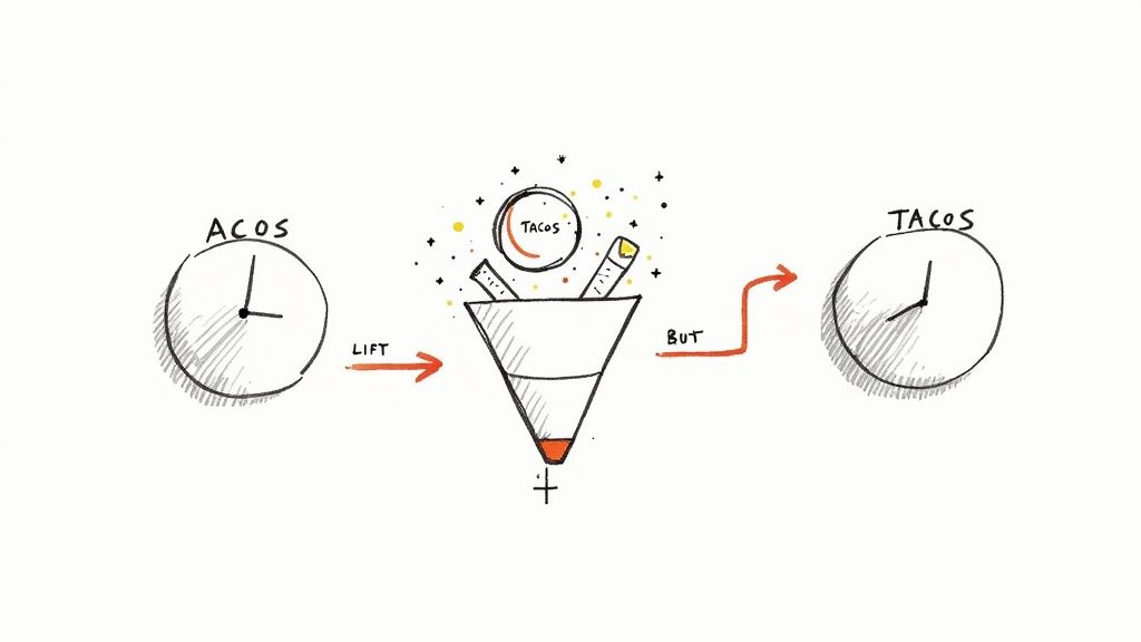
Many Amazon sellers get tunnel vision, focusing only on ACoS (Advertising Cost of Sale). It’s a useful metric, for sure, but it only shows one part of the story: how much you spent on ads to get a sale directly from an ad click. It completely misses how your ads are lifting your organic sales, which is often where the real magic happens.
ACoS vs. TACoS: The Bigger Picture
This is where TACoS (Total Advertising Cost of Sale) becomes your best friend. Your Helium 10 dashboard puts this front and center, calculating your ad spend against your total sales—both paid and organic. This gives you a much healthier, more complete view of how your ads are impacting your brand’s overall performance.
A great way to think about it is this: ACoS tells you how a single marketing campaign performed. TACoS tells you if your entire marketing strategy is working. A low and steady TACoS is a sign that your ad spend is creating a positive flywheel, successfully driving more organic sales over time.
For instance, you might see a high ACoS when launching a new product, and that's perfectly fine. You're paying for visibility and those crucial first sales. But if your TACoS is also shooting up and staying there, that’s a red flag. It signals that your product is becoming dependent on ads and isn't gaining any organic traction.
Making Smarter Decisions With Your Dashboard
The advertising widgets on your dashboard let you track both ACoS and TACoS right next to each other. This direct comparison is what empowers you to make smarter, more informed decisions about where your ad dollars go.
Here's how you can put this into practice:
- New Product Launch: Expect a high ACoS out of the gate. Your goal is to see TACoS start to trend down after that initial push, which means your organic rank is starting to climb.
- Mature Products: For established products, you want to see a stable or decreasing TACoS. If it starts to creep up, it might be time to refresh your keyword strategy or optimize your listing to improve organic conversion.
- Seeing the "Halo Effect": A low TACoS is proof of the "halo effect." This is when your paid ads build brand awareness and momentum, leading to customers finding and buying your product organically.
And while the Helium 10 dashboard is your command center for on-Amazon advertising, you can get an even broader view of your off-Amazon marketing impact by exploring the Amazon Attribution program.
By shifting your focus to the relationship between ACoS and TACoS, you stop just spending on ads and start investing in sustainable, profitable growth for your brand.
How to Gain a Competitive Edge with Market Tracker
Running an Amazon business can sometimes feel like you’re operating in a vacuum. You watch your own sales, tweak your own listings, and hope for the best. But real, sustainable growth happens when you look outside your own four walls and understand the entire competitive arena.
This is where the Market Tracker tool in your Helium 10 dashboard becomes your secret weapon. It’s like having a scout constantly reporting on what your rivals are up to, letting you shift from being reactive to truly strategic. You'll stop just managing your store and start outmaneuvering the competition.
Setting Up Your Competitive Battlefield
Getting started is surprisingly simple. Your first job is to define your "market"—basically, you tell Helium 10 who you're up against and what you're fighting for.
- Add Competitor ASINs: Start by plugging in the ASINs of your top three to five direct competitors. Think about the products that always seem to show up right next to yours in search results. Those are the ones you want to watch.
- Include Relevant Keywords: Next, add the main keywords that shoppers use to find products like yours. This context helps Market Tracker understand the specific niche you're competing in.
Once you’ve done this, the tool gets to work, pulling in data to give you a complete picture of your corner of the Amazon universe. It's like having a dedicated analyst on your team, watching your competitors 24/7.
Think of Market Tracker as your personal market intelligence report. It’s not just about seeing who is number one; it’s about understanding why they are number one and mapping out a clear path to take that spot.
Analyzing Key Competitive Data Points
With your market defined, the dashboard lights up with the kind of insights that win battles. Helium 10's Market Tracker provides a live look at total market revenue, pricing trends, and how every competitor is performing. You'll see detailed data for each ASIN, including daily updates on estimated sales, review counts, and Best Sellers Rank (BSR). For a visual walkthrough, check out this overview of market tracking features on YouTube.
This lets you dig into the metrics that really matter.
Market Tracker reveals the critical data points that separate the winners from the losers. Here's a breakdown of what you should be looking at.
Key Market Tracker Metrics Explained
| Metric | What It Tells You | Actionable Insight |
|---|---|---|
| Market Share % | The exact slice of the pie your brand owns in terms of total market sales. | Are you gaining or losing ground? This is your ultimate report card against the competition. |
| Competitor Pricing | A daily log of every price change your rivals make. | Did someone just launch a flash sale? Or are they slowly raising prices? This informs your own pricing strategy. |
| Review Velocity | How fast competitors are getting new reviews. | A sudden spike can signal a successful launch, a new promotion, or a review campaign you need to counter. |
| Total Market Revenue | The combined revenue of all players in your defined market. | Is the market growing, shrinking, or flat? This helps you understand if you're fighting for a bigger piece of an expanding or contracting pie. |
These metrics aren't just numbers on a screen; they are signals telling you when and how to act. A great way to conceptualize your overall brand presence is by looking into your Share of Voice (SOV).
Let’s put this into a real-world scenario. Imagine you log in and see a key competitor’s price dropped by 15% overnight. You also notice their BSR is climbing and their sales are ticking up. Without Market Tracker, you might not spot this trend for weeks, by which time you've already lost sales.
With this data in hand, you can react immediately. Maybe you launch a coupon to stay competitive, or maybe you double down on your ad spend to protect your ranking. This is how you stop playing defense and start winning.
Putting Your Dashboard Insights to Work
Seeing the numbers on your Helium 10 dashboard is just step one. The real magic happens when you turn that data into decisions that actually make you more money. Think of your dashboard as your business’s EKG—it shows you the vitals, but it’s up to you to diagnose the problem and write the prescription.
Let's walk through a situation I see all the time: your revenue is going up, but your profits are flatlining or, even worse, dropping. This is the classic "leaky bucket" scenario. Sales are pouring in the top, but profit is seeping out through a hole somewhere in the bottom. Your dashboard is how you find that hole.
Finding and Fixing Profit Leaks
When your margins are shrinking, you have to play detective. The dashboard is your magnifying glass, letting you systematically check the usual suspects until you find the source of the bleed.
Here's a quick diagnostic checklist I run through:
- Check Your Ad Spend: Is your TACoS (Total Advertising Cost of Sale) creeping up? If it is, you're paying more to acquire each sale, which means your ad campaigns are losing steam or you're just too dependent on paid traffic.
- Look at Refund Rates: Nothing kills profit faster than a sudden jump in refunds. The dashboard will flag this trend immediately, pointing you toward a potential quality control issue, an inaccurate product description, or even shipping damage.
- Review Your COGS: Have your supplier costs gone up? If you haven't updated the Cost of Goods Sold in the Profits tool, your dashboard might be painting a rosier picture than reality. It's a simple fix, but one that's easy to overlook.
By isolating the problem, you can stop stressing about your numbers and start taking action. That could mean fine-tuning a PPC campaign, pulling a defective batch of inventory, or getting on the phone with your supplier.
Reacting When Competitors Make a Move
Here’s another all-too-common scenario: you notice a competitor's Best Seller Rank (BSR) is suddenly shooting up. That's a huge red flag that they're gaining ground, and you need to figure out why before you start losing your spot. This is where you pull together data from different parts of the dashboard.
The Helium 10 dashboard doesn’t just show you what’s happening in your own store. It gives you the full market context, so you can see how you stack up. How fast you react to what your competitors are doing often separates the market leaders from everyone else.
A structured approach is always best. Here's a simple workflow for using the Market Tracker tool to analyze and respond when a competitor gets aggressive.
This process isn't complicated. It’s about setting up your tracking, paying attention to the data that comes in, and then making a smart, strategic decision instead of a panicked one. A competitor's win can be your best learning opportunity.
To figure out their game plan, here's what you do:
- Jump into Market Tracker: Find the exact date their BSR started to climb. Was it right after a big price drop? Or maybe they suddenly got a flood of new reviews?
- Run Their ASIN Through Cerebro: Grab their product ASIN and plug it into Cerebro. This will show you if they've started ranking for powerful new keywords that you aren't targeting yet.
- Build Your Counter-Move: Now you've got the intel. Your response could be anything from adjusting your own price, launching a specific PPC campaign targeting their new keywords, or updating your listing images and copy to hit their weak spots.
This is how you turn raw data from the Helium 10 dashboard into a clear, actionable plan that protects your sales and grows your profit.
Got Questions About the Helium 10 Dashboard?
Diving into a new tool always brings up a few questions. Even after you get the hang of the features, you'll run into specific scenarios that make you wonder, "How does this actually work for my business?" Let's clear up some of the most common questions sellers have about the Helium 10 dashboard.
How Often Does the Dashboard Update?
This is probably the number one question I get. In e-commerce, stale data is bad data. The good news is, Helium 10 updates different sections at a pace that makes sense for the data it's showing.
Your core financial metrics from the Profits tool—we're talking sales, revenue, and profit margins—refresh multiple times an hour. This gives you a nearly live look at your store's performance. You can launch a PPC campaign and see the impact on your sales almost immediately.
On the other hand, data in tools like Market Tracker typically updates daily. This is by design. Broader market trends, like a competitor's BSR or pricing strategy, don't change meaningfully minute-by-minute. A daily snapshot gives you a stable baseline for making strategic decisions without getting caught up in tiny, insignificant market ripples.
Can I Customize the Dashboard View?
Yes and no. You can't just drag and drop widgets around like you're rearranging your phone's home screen. The real customization power lies in the filters and the setup of the tools themselves.
You have complete control over the date ranges for almost every metric. Want to see how last week's sales compare to the same week last year? Easy. Need to analyze performance since you launched a new product 30 days ago? Just set the custom date range. This is essential for spotting trends and generating reports that actually mean something.
The most powerful customization happens behind the scenes. When you tell Market Tracker which competitors to watch or plug your exact unit costs into Profits, you're fundamentally personalizing the data that feeds the dashboard. You're turning it from a generic tool into a command center built specifically for your brand.
How Accurate Is the Profits Data?
The accuracy of your profit data is a partnership between you and Helium 10. Helium 10 does the heavy lifting by pulling your revenue and all Amazon-side fees (like FBA fees, referral fees, and ad spend) directly from your Seller Central account via the API. That part is spot-on.
The piece you control is your Cost of Goods Sold (COGS). For the profit calculation to be accurate, you have to go into the Profits tool and enter the cost for each of your products. Once you've done that, Helium 10 can subtract all of those costs from your revenue and give you a precise calculation of your true profit and margin.
Just remember to keep it updated! If your supplier gives you a new price, make sure you update your COGS in Helium 10. A dashboard is only as reliable as the data you feed it.
Main Dashboard vs. Adtomic Dashboard
It’s easy to get these two mixed up. The key difference is the level of detail—think of it as looking at a world map versus a detailed street map of a single city.
- The Main Dashboard is your C-suite overview. It shows you the health of your entire business at a glance. You see your total sales, net profit, and market share, with a summary of your advertising (like TACoS) to see how it all fits together.
- The Adtomic Dashboard is your PPC manager's command center. It's a deep dive focused only on your ad campaigns. Here you get the nitty-gritty details on individual campaigns, ad groups, keywords, and search terms, with metrics like ACoS and conversion rates broken down to the smallest level.
Basically, use the main dashboard for a quick, daily check-in on your business's overall health. When you need to get your hands dirty and actually optimize your ad campaigns, you head straight to Adtomic.
Stop overpaying for essential e-commerce tools. With EcomEfficiency, you get access to Helium 10 and 50+ other premium platforms for a single, low monthly fee. Cut your software costs by up to 99% and get the tools you need to scale your business. Find out more at https://ecomefficiency.com.